Thursday 23 October 2014

Survey Monkey Results


The results that I get from this shows that most of the people who did my survey were males, although I sent it out to an equal number of males and females.


This shows that the majority of people who answered my survey are still in college, only one of them said that they were 19 or older an one person skipped the question.


The majority of people go to the cinema to watch a film once a month, no one said that they went more often then that, one person even said that they go to the cinema less then once a year.


This chart shows that most people prefer to watch comedy movies, closely followed by horror or action, then adventure, then romantic and romantic comedy. One person said that there was another genre but i forgot to put a 'Please Specify' box in it.


A film trailer is what most persuades people to go and see a film, i want to try and change that with my film poster, make them want to see it more without seeing a trailer. Seeing famous actors in a film also makes people want to go and see it. This is followed by the name, the poster itself and the genre, only two people said that seeing a review of the film makes people want to go and see the film.


Some people are willing to pay up to £10 and more for a film, the majority aid that the would pay up to £6 to see a film, only one person each chose that they would pay up to £2 and up to £4.


Friday 17 October 2014

Pre-Production Textual Analysis

          This is an action film poster. It has a close up of the main characters face, whilst she is doing an action. This is what mostly happens in action film posters. They usually have a picture of the main characters, doing something to do with action, in this example she is shooting a bow and arrow. They usually have the title at the bottom and the slogan at the top, and sometimes they have the names of the most famous actors or the main character. Not all of them are the same though, they can have the title of their film anywhere, but the average place is the bottom.They also mostly have the release date if the film or the DVD. They will always have the protagonist and/or other characters in some sort of action shot though, they might be standing in front of an explosion or whatever, but it will mainly be an action shot, which goes you a bit of an insight into what the film will be about.


          This is a horror move poster, of the very popular film Friday the 13th. This is very similar to the acton movie poster. It has a big title at the bottom of the page, with the slogan or actors at the top. This is the same throughout most of the horror movie posters that I have seen. Another thing that the majority of them have is the evil bad creature that will be the death of many people during the film. An example, this film, friday the 13th, has Jason who goes around killing people who go to Crystal Lake. On all the film posters for all the films either he is on them himself, or the iconic image of the film, his hockey mask. So most of the time they do have the creature itself, or an iconic weapon or clothing that they use to portray the film. They are designed to send a chill down the audiences spin just by looking at it, making them want to watch the film... Or run away screaming but mainly to make them watch it.


          Action and Adventure are quite similar in genre, but a film that is more based of adventure tend to have more then just a close up of the main character on the film poster. Like this one the tend to have all the main characters, rather then just one. Again they have the big title of the film at the bottom of page, with the main characters or slogan at the top of the it. This is the tendency with all the adventure posters that I have seen. The also will have some sort of possible action scene gong on in the background, for example, with this poster there is the three main actors at the top of the top of the poster just under their names, then towards the bottom of the page there is a seen of actions, ships being attacked by a gigantic octopus creature.


Friday 10 October 2014

Signs and SignifiersPoster


For out poster we wanted to make a new TV shoe that was based on equality, hence the name of the show. The slogan of the poster 'Does it still exist' kind of lets on what the show is about, more then the title. It shows that the show is about some who isn't being treated as a equal. With the picture that we took, we have it so that there is a white person sitting away from the other, when there is a big space between her and the other. The girl on the right is hiding her identity, not wanting anyone else to see who she is. However this could be seen in two different ways, the first way is the one I have just explained, a bit of a racist way, but the other one is that you don't know what the girl on the right has done, why she is sitting there, she could have done something really bad and people don't want to be around her because of that, not because of who she is.

Thursday 9 October 2014

Magazine Front Cover Analysis


          Magazine front cover analysis


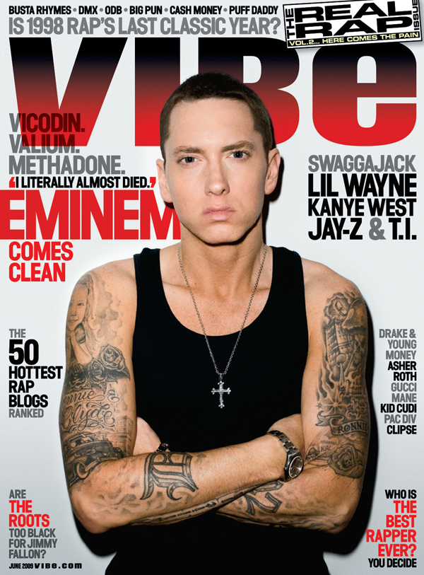
          This is the magazine cover of one issue of VIBE. This is a magazine all about rap music and the rappers who create them. The main image of this cover is Eminem, a very well known rapper who has had a very successful career. In his songs, he relates to his audience making them feel a part of his life. They have chosen Eminem to be the main image of this magazine because one of the main stories in the magazine is about him. He has a big fan base of people who like rap, and so this image would attract them to buy the magazine. It also says in the cover lines that 'Eminem comes clean', this is about his use of drugs. A quote, which is most likely from him says 'I literally almost died'. This is sort of an enigma code. Although it says a few drugs above this, you still want to know how he nearly died, how much he took for it to get to that point. He is also looking directly at the camera, and so on the cover this makes it feel as if he is connecting to you. The masthead says VIBE. this is so that you know what magazine it is, and so you can relate to this magazine as having a popular rapper in it. However, the image is more likely do persuade the reader to buy it rather then the title itself, as there will be some people who have no idea what the magazine is, but they like Eminem and so want to read it. 

          I would say that the target audience for this magazine would be 16-25. Although a lot of older people might rapping there are more younger people who like this kind of music. The class that i think this will fall under is D and E


          This is a gaming magazine and is obviously all about new games that are coming out soon, or in the future, and it can have the most recent games and the older generation games. The main image for this cover is of a game that has recently come out called Alien: Isolation. This magazine however, was issued in February, when the game was only just announced and so having this image on the main cover would make people want to buy it. It also says exclusive access to the game which is coming out, so that would also make people want to buy the magazine, so they can learn about the game and see if it is something that they would want to invest in. This image takes up most of the cover, there isn't much writing on it. The masthead is at the front of the image, which is different to most magazines because they usually have the main image coving a bit of the masthead, in this magazine they don't want to take away that it is the official magazine for XBOX, and they have put a nice big picture of their logo on the front as well, so you know that it is definitely an xbox magazine. There are other cover lines around the image as well, but they are smaller then everything else. They name different games, it says 'Plus All Of This' So it makes you feel like you are getting a lot more in the magazine then just the Alien: Isolation information. But you should already know that that isn't all thats going to be in the magazine, but the way they word it makes it seem as if there is so much more in the magazine then you are paying for.

          I would say that for this magazine the target audience would be 14-21. I think this mainly because it is the younger people who tend to play more video games. Even though the games that they mention are a higher rating then the minimum target age for the magazine, a lot of people have games that are aged higher then them, and i would say up to 21 for the target audience because educing all the imd whilst you are ageing up, you are at school and college and might only have a part time job. At the age of 21 is when some people start look at full time jobs. I think that this would fall under the class of D and E as well, possibly C2